Thursday, June 3, 2010

Early Modern 1910-1935


This was a period when artists broke away from the tradition of the socialist philosophies of the Arts and Craft movement and the romantic and nostalgic excess of the Victorian Era. These artists were described as "avant garde" (new and experimental). These movements includes Bauhaus, Constructivism, Dada,De Stijl, Expressionism, Futurism, Surrealism and Heroic. The common element with all these movements was dissatisfaction with the past, a radical need for a change in society and to experiment in art, design,architecture and fashion.
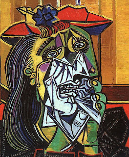
Picasso and his fellow artists invented a new approach to handling space with figures abstracted into geometric shapes. This of course challenged the 400 year old way of seeing pictorial art.

Picasso's Weeping woman

http://www.metmuseum.org/TOAH/HD/pica/hd_pica.htm .


The prestigious Bauhaus, was the school in which all of the Fine Arts and Crafts were combined. The Bahaus was mostly influenced by the lack of ornamentation which has become the International style in architecture. It was due to the modernist movement that the Bauhaus came to become one of the most famous places for the development of the arts, especially architecture.


michelleelkin.wordpress.com

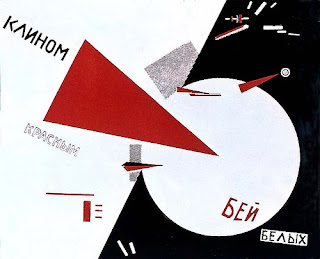
A poster from the period showing the use of san-serif fonts, clean lines, flat colors, diagonal and, white space;

The constructivists took an artistic outlook aimed to encompass cognitive, material activity, and the whole of spirituality of mankind. The artists tried to create works that would take the viewer out of the traditional setting and make them an active viewer of the artwork.


“Beat the Whites with the Red Wedge” by El Lissitzky in 1920.


Posters designed from Constructivist artists that used geometric abstraction along with dynamic angles and view points, photomontage, cinema, abstract uses of light and contrast.


www.tate.org.uk

Friday, May 28, 2010

Digital Period.


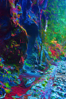
Digital art
http://www.crazyjunkyard.com

Digital Period 1985-Present

This period is not an historical style as with the “contemporary style” as it is happening now.

The impact of digital technology has transformed traditional activities such as painting,drawing and sculpture, while new forms, such as net art, digital installation art, and virtual reality, have become recognized artistic practices.More generally the term digital artist is used to describe an artist who makes use of digital technologies in the production of art. In an expanded sense, "digital art" is a term applied to contemporary art that uses the methods of mass production or digital media.

With computers designed to create clean layouts, the digital look doesn’t look digital. The artists using computers are creating works that look messy, layered, extreme, unstable, poetic and expressive. This seems to run parallel with what is known as street fashion, loose, casual and messy and the use of big logos.

Some of the artists who influenced this style were Andy Warhol and Basquait. They were both known for stretching the boundaries of their paintings. At times the results were crude, primitive disjointed and messy. Yet they remained charming in a “pop art” sort of way.


Digital Dali (google images)


red assassin www.rodnymela.com
use of typography to in a modern design
statc.guim.co.uk


Tuesday, May 25, 2010

Contemporary art


Contemporary period 1975-present

Todays contemporary art is clean and simple and had its beginnings in Swiss design as well as other historical styles. It reflects what’t in style currently.

Still prevailing in many contemporary designs is the swiss system of grid alignments, formal organisational systems and the use of sans serif type

Contemporary art, the art of the late 20th century and early 21st century., both an outgrowth and a rejection of modern art As the force and vigour of abstract expressionism diminished, new artistic movements and styles arose during the 1960s and 70s to challenge and displace modernism in painting, sculpture, and other media. Improvisational and Dada-like styles employed in the early 1960s.

The most significant of the often loosely defined movements of early contemporary art included pop art, characterised by commonplace imagery placed in new aesthetic contexts, as in the work of such figures as Andy Warhol and Roy Lichtenstein. The optical shimmerings of the international op art movement in the paintings of Bridget Riley, Richard Anusziewicz, and others; the cool abstract images of colour fields painting in the work of artists such as Ellsworth Kelly and Frank Stella (with his shaped-canvas innovations); the lofty intellectual intentions and stark abstraction of conceptual art by Sol LeWitt and others; the hard-edged hyperreality of photorealism in works by Richard Estes and others; the spontaneity and multimedia components of happenings; and the monumentality and environmental consciousness of land art by artists such as Robert Smithson. One of the most long-lived of these movements was the abstract development known as minimalism, which emphasized the least discernible variation of technique in painting, sculpture, and other media.

Arising from the multimedia experiments of the 1970s, the widespread use of a variety of technology-based media has persisted into the art of the new century. Often included are elements of film, video, sound, performance art, and architecture (principally in installation art). Another trend that has widened the definition and scope of contemporary art has been the conceptually driven use of both photography and language as the substance of numerous works of art.

http://www.infoplease.com/ce6/ent/A0813364.html

Photorealism an approach in this contemporary art work (google images)


From the graphic design point, simple and straight forward design is the contemporary philosophy.Thus making complex information simple to understand.

Creative typography is a major trend and can use a minimalist layout using only an all type approach. The manipulation of the type can add an interesting approach from the normal straight forward. It can add perspective, motion as well as playfulness.


The use of type in this poster for a James Brown concert (google images)


Creative typography and a minimalist layout (google images)


Op-art painting by Bridget Riley
www.berkshirefinearts.com/uploadedImages/articles/166_Institute-of-Contemp966022.jpg

Monday, May 24, 2010


American Kitsch 1940-1960

The Industrial Revolution brought with it an evolution in consumption. People from all social classes could now participate in mass consumption and objects d'art could now be mass-produced. Many high-minded members of the intelligentsia were distraught. And the term kitsch evolved to disparage mass culture. The word itself is derived from the German 'kitschen' which means to throw together a work of art.

In the fifties, people wanted change. The bleakness of the war years created a hunger for variety and experimentation. Many people could now afford non-essential items. And art began to evolve from elements of mass popular culture. A new industry of kitschdom arose.

Today kitsch has been reinstated as amusing, curious and ridiculous. In fact the very awfulness of kitsch is what is appealing. According to the director, John Waters, "In order to acquire bad taste one must first have very good taste."

An Introduction to American Kitsch http://www.suite101.com/article.cfm/american_kitsch/29885#ixzz0ov6DUDzb

The birth of Kitsch brought about the first youth movement. The youth started to dress independent of adult fashion. They started to dress in practical, easy to wear work clothes like jeans and T-shirts.

The artists of the day took up this look which became the "Norm" for the creative radical.

This movement was represented by James Dean the American Film star.

James Dean (google images)

Poster from the movie Rebel Without A cause (google images)

This period also brought about both radical changes to mechanical designs as well as architecture. In air travel the DC-3 was the leader of all commercial airlines. With the roundness of the nose, it became inspirational for types of industrial products.

DC-3 (google images)

Automobile from the era shoeing exaggerated lines and curves. (google images)

Other designs from this era.
salt and pepper shakers (google images)

red lips telephone (google images)

Drive in Restaurant (google images)


Poster for a Bus Company (google images)
Badge for political purposes (google images)


Poster explaining the characteristics of Postmodernism (google images)


Postmodernism the world, influences,style and designer

Characteristics of Postmodernism
There is no absolute truth
Truth and error are synonymous
Traditional authority is false and corrupt
Disillusionment with modernism
Morality is personal
Globalization
All religions are valid
Liberal ethics
Pro-environmentalism


To understand postmodernism we must look at what came before. “Modernism”
was loosely used to describe many “Modern” things.... from the latest gadgets to
a style of art. It also refers to a range of cultural ideas, beliefs and the artifacts
that were produced during this period. Modernists believed that science had
shaken the foundations of traditional authorities and truths. It presupposed that
an understanding of human identity and self that was unified,coherent, and
autonomous: man was a thinking being capable of rationally perceiving, knowing,
and conquering the world... and he would.


Poster from the Postmodernist Period (google images)

Postmodernism like Modernism rejects all boundaries. This rejection includes
the boundaries between different forms of art.
The postmodernist focuses on a de-structured, de-centered humanity. This
means that the idea of disorder and fragmentation which were previously seen as
negative qualities are now seen as acceptable representation of reality by
postmodernists. They also accept that the possibility ambiguity> things and
events can have two different meanings at the same time. Postmodern thought
is, an adventure and an expression life experience. It is an attempt to question
the world that we see around us and not to take other peopleʼs views as the final
truth. It puts everything into question and radically interrogates them.
Postmodernism with all its complexity and excesses is an attempt to find the new
and more truthful versions of the world


Postmodernism in graphic design has been a visual and decorative movement. It
appears to be a continuation or the re-evaluation of the modern. It seems that
this re-evaluation is also just a component of the graphic design process.
Postmodernism saw a massive popular raising at the end of the seventies in the
form of Graffiti and Hip Hop culture. Graphic forms of expression became a
hobby amongst school children all around the developed western countries. This
phenomenon worked as a stepping stone towards the graphic infrastructure that
is applied to the majority of computer interfaces today

"Early Moses" Painting by the artist Basquiat. (google images)

Jean-Michael Basquiat catapulted from being an unknown graffiti writer to becoming one of the most successful, controversial and glamorous artists in the world.


Painting by Basquiat (google images)


Reebok Sneakers designed by Basquiat

Monday, May 17, 2010

The Late Modern Period 1945-1970


Thinking made visual Saul Bass
(google images)


The Italian Vespa was cheap easy to maintain and very relaible.
(google image)

The Late Modern Period 1945-1970


The Late Modern period was from 1945-1970 and was dominated by American inventions. The artists were inspired by the European avant-garde’s early approaches to modern art. The modernist none-decorative approach was adopted, but their dogma was rejected. The results were that there was a new simplicity to their work.


After World war two there was a shortage of raw materials such as metal and fuel. This inspired artists of all persuasions to be “frugal” with materials. This resulted in a combination of function and simplicity.


During this period, images of destruction haunted the collective imagination. The nuclear threat, and the response to it, will be seen through graphics, art, film and imaginary schemes.

Graphic styles seemed to reduce an array of predictable images to the minimum of elements. The designer Saul Bass would strip away visual complexity from messages and used simple photographs that exert great graphic power.

Another designer was Lester Ball who helped to revolutionise the American graphic design movement. He used symbols and object photography in a layered, collage- like manner.


This period saw graphic design in the modern style gain widespread acceptance and application, while it simultaneously stagnated. Notable names in mid-century modern design are Adrian Frutiger designer of the typefaces Univers and Frutiger; and Josef Muller-Brockman , who designed posters in a severe yet accessible manner typical of the 1950s and 1960s.

The reaction to the increasing severity of graphic design was slow but inexorable. The origins of post-modern typography can be traced back as far as the humanist movement of the 1950s. Notable among this group is Hermann Zapf who designed two typefaces which remain ubiquitous -- Palatino (1948) and Optima (1952). By blurring the line between serif and sans-serif typefaces and re-introducing organic lines into typography these designs did more to ratify modernism than they did to rebel.


An important point was reached in graphic design with the publishing of the First things first 1964 Manifesto

The First Things First manifesto was written 29 November 1963 and published in 1964 by Ken Garland. Today we may not understand the significance of the document which at the time caused constenation. It was backed by over 400 graphic designers and artists which was a call to a more radical form of graphic design and criticised the ideas of value-free design. This was massively influential on a generation of new graphic designers and contributed to the founding of publications such as Emigre magazine

Emigre is a graphic design magazine first published in 1984 in San Francisco, California, USA. Art directed by Dutch-born Rudy VanderLans using fonts designed by his wife, Czechoslovakian-born Zuzana Licko.

A Saul Bass Poster for the Film
Such Good Friend
(google images)

Monday, May 3, 2010

Swiss period 1950's

Examples of Swiss design posters

(google images)

Swiss design or the International Style.

-Developed in Switzerland in the 1950's. It's emphasizes cleanliness, readability and objectivity. It has an asymmetrical layout, a grid, sans-serif typefaces. The grid was of horizontal and vertical lines used to align the elements in their designs.


Josef Müller-Brockmann’s visualization


Josef Müller-Brockmann was a Swiss graphic designer and teacher, mostly recognised for his simple designs and his clean use of typography, notably Helvetica and Akzidenz Grotesk. His shapes and colours have inspired many graphic designers in the 21st century, and made him one of the main precursors of the International Typographic Style, also known asSwiss Style.


Most people are surprised to learn that there are more 20th century poster masterpieces from Switzerland than any other country. There are many reasons: an international tradition w
hich absorbed and often mimicked the best of its neighbors; a vigorous national program to promote the poster and its printers; and a series of great teachers who advanced the art of the poster. Yet most collectors have missed out on this rich tradition. What appears to be an elegant French poster or an unabashedly direct German one could very well be Swiss.

Tuesday, April 6, 2010

Art Nouveau 1890-1910


Art Nouveau 1890-1910
It was the first style of commercial art used to enhance the beauty of industrial products. It was also the first international style used in all Europe and America. It was a rebellion against the Victorian sensibilities.

A reaction to academic art of the 19th century, it is characterized by organic, especially floral and other plant-inspired motifs, as well as highly-stylized, flowing curvilinear forms. Art Nouveau is an approach to design according to which artists should work on everything from architecture to furniture, making art part of everyday life.

Above is the staircase of the Maison & Atelier of Victor Horta. This building is one of four Horta-designed town houses in Brussels that are together recognised by UNESCO as "representing the highest expression of the influential Art Nouveau style in art and architecture.

The style of architecture brought daylight into houses by the use of large windows and soft colours for the interior decoration.
The designs continued to use organic forms based on nature as well as the use of Asian styles, which included curvilinear shapes and decorative motifs.


A copy of a typical door produced during the period.

Art Nouveau design executed in cathedral, irridescent, and opalescent glass for a combination of transmitted and reflected light to provide interest in daylight and at night.


www.stainedglassclasses.com/
Nic%27s%20Art%20G.


Paintings by Gustav Klimt. These were completed during the Art Nouveau period


Monday, March 29, 2010

Psychedelic Period.


http://www.buzzle.com/articles/60s-psychedelic-art.html


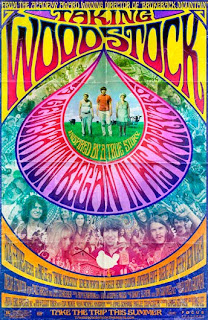
The distinctive characteristic of psychedelic art is the beautiful, colorful images that have a surreal feel to it. Psychedelic paintings are inspired by certain experiences. This art made use of beautiful and bright forms with detailing and such compositions always illustrated the psychedelic experiences felt by the artist. Surrealistic drawings, brightly colored patterns, detailing and even morphing were used to depict various scenes.

The term 'psychedelic' is used in relation with the experience that is felt by the person when in a rather ‘psychedelic’ state of mind.


A magazine issue devoted to artists of the 60s with a few dozen pages about poster design, include an article on Family Dog and another about Victor Moscoso. There's http://www.buzzle.com/articles/60s-psychedelic-art.html10 full page poster reproductions, with somewhat muted colors and some smaller reprints of Moscoso's posters accompanying the article about him. Plus the cover which is clearly by Moscoso as well.


Monday, February 22, 2010

The Arts and Craft Movement.

The Arts and Craft Movement was a period that reacted against poor aesthetics of Industrial Design. They wanted to fight against ugliness in all forms and were about quantity not quality. They designed with natural forms, usually taken from nature, plants in particular. Thus creating balance and harmony.


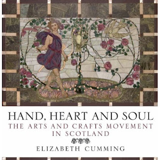
Above is a book cover promoting the Arts and Craft Movement. As you can see it has been designed with natural forms and there is unity and balance in the composition. The border around the image is simple and aesthetically pleasing. (google images)


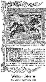
This is a page was designed by William Morris the " Father" of the Arts and Craft Movement.
It uses the Caxton font and has a feeling of an Illuminated Manuscript of earlier times.

(google images)